When Speak Agent, Inc. decided to add a version of its learning platform for secondary students to its roadmap, an opportunity presented itself: creating a user interface and design system from scratch, but with the scope of content already known.
Discovery
The first step in the process was a meeting with marketing, engineering, and product management to define the business requirements for a version of the app for tweens and teens learning English and to discuss technical constraints. What initially was envisioned as a simple re-skinning to make the interface less “childish” evolved into a broader thinking through of an information architecture and interface better suited to the more developed cognitive abilities of this age range.
I dived into Design for Kids by Debra Levin Gelman to glean insight into organizing information and navigation for these age groups. I conducted online research into learning apps popular with teens and such things as color and graphics preferences.
Definition
The secondary solution’s goals and requirements were defined. They included:
- An overall look and feel that didn’t turn off older students. That meant
- swapping in photos from the database to use as word symbols, instead of the illustrations used for primary-age kids,
- removing the boy and girl characters in the interface, and
- desaturating the color palette.
- A site architecture that accounted for high school students having more than one teacher and assignments in a wider range of subjects.
- In response to teacher feedback from the primary version, a more visible way for students to do completed lessons and activities again, to reinforce learning.
Prototyping
Due to a tight schedule, the design process was compressed. On a parallel time track with discovery, the team met to reach consensus on the key purpose of each screen and to review wireframes of increasing fidelity.
This resulted in a clickable design prototype that was informally tested with 4 of the staff’s teens. A testing script focused on key questions of concern: Did users know what lessons they needed to work on, could they find lessons by subject, and could they easily see what they’d already done?
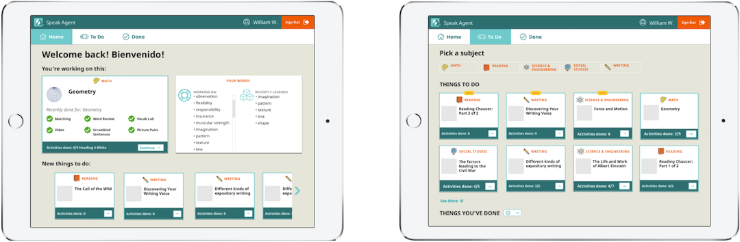
Teens tested the screens in a Marvel prototype in a device frame. The greeting is in English and Spanish to encourage language learning for all students. *Note: Prototypes reflect design before product release, after my tenure.
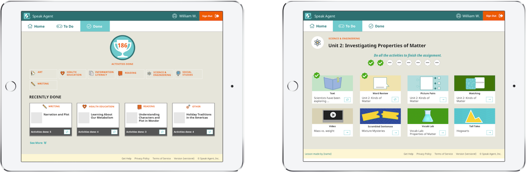
The number in the trophy, above left, counts up live on page load. Lesson progress, above right, is indicated with animated checkmarks.
Design
The version of Speak Agent for grades K–6 was designed and built in an organic way, prior to my tenure, evolving as the company moved from alpha to launch. The secondary version was a chance to start with a clean slate visually and in code—the css and html templates.
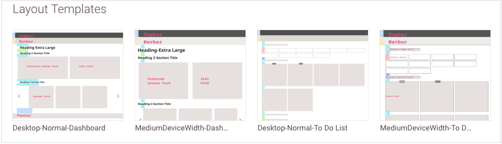
Starting with paper and pen, I worked through all the elements and components across the app, inspired by Harry Roberts' Inverted CSS model. Working in Sketch, I built a UI system that included typography, color, button states, and components in context, and naming conventions to facilitate the front-end developers writing leaner and more maintainable css. I settled on a grid with 8px as a base unit, and then built abstracted layouts for each screen, for laptop+ and tablet viewports.
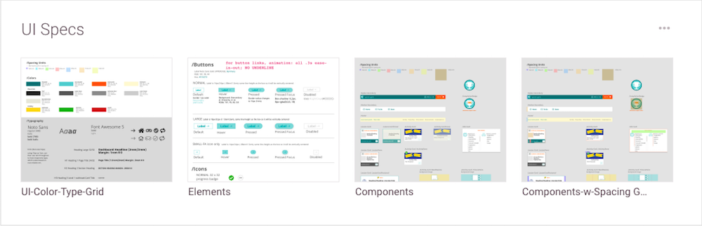
The design system, from base elements to components and layouts, was uploaded to Zeplin for developers to get css and graphics.
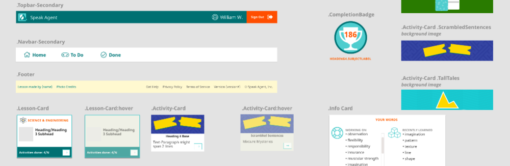
The design system included naming conventions for all UI components.
Design work also included creating a system of icons for academic subjects that were age-appropriate and could help newcomer students with low reading skills to find their assignments, and “aging up” the lesson activity graphics.
Results
The developer team was able to build out the secondary version of the app over an extended six-week sprint. The product manager, after doing QA and integration testing, remarked that she no longer wanted to look at the primary version (that version was given a design refresh but implementation was delayed as other features took priority in the roadmap).
Lessons Learned
In working out the design system and naming conventions, I realized that I needed to stop designing screens in isolation. Every design nuance would lead to a lot of extra css and html to account for variations that served no real purpose (except making me feel like a “capital D” designer). I educated myself on creating nested symbols and flexible buttons in Sketch, vastly speeding up work. I also educated myself on creating responsive background images and flexbox, and shared the knowledge with the dev team. This enabled them to build more responsive layouts, a boon for a school population increasingly using Chromebooks.