Ken Burns’ documentary series, including The Vietnam War and Baseball, have won acclaim from audiences and praise from classroom history teachers. But by summer 2019, stakeholders felt that neither of two websites focused on the films was really serving educators as well as originally envisioned. As a result, a team with PBS LearningMedia undertook a months-long process to create a re-imagined online experience to be unveiled at a national conference of social studies teachers.
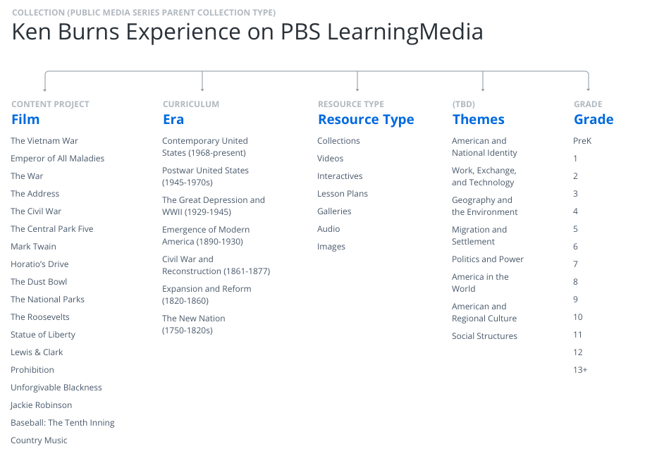
PBS LearningMedia houses a vast array of teaching resources, including videos, image galleries, lesson plans, and interactives, aligned to a variety of state and national curriculum standards for teachers grades K–12, as well as professional development resources.
Goals
Redesign the existing site at PBS to:
- make it easier for teachers to identify relevant film content;
- organize content to better match how teachers build units and lesson plans; and
- better address the needs of both novice and master teachers to provide differentiated instruction.
Challenge
I joined PBS in May. To allow sufficient time for visual interface design, development and QA for a November public launch, I had the challenge of compressing discovery, heuristic analysis, wireframing, stakeholder feedback, and user testing into a very tight window of time, about six weeks, while also adjusting to my role in a large, matrixed cross-functional team and gaining an understanding of external stakeholders.
Constraints
The PBS LearningMedia collections have a specific data structure; the visual design needed to meet branding requirements and coordinate with the rest of the site.
Process
The work passed through multiple phases:
- Discovery, including multiple in-person interviews with local history and social studies teachers, and research on state curriculum standards
- Comparative audit of sites with similar goals and audiences
- Survey and 30-second gut check with external stakeholders
- Heuristic analysis and usability testing of three Ken Burns’ related sites
- Multiple rounds of sketching, wireframing, and unmoderated testing of prototypes
- Interface design
- Post-launch unmoderated testing of live site
Comparative audit and gut check
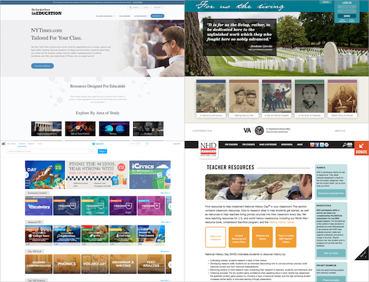
Stakeholders took a 20-second gut test of several website home pages with similar goals and audiences.
Heuristic analysis and usability testing
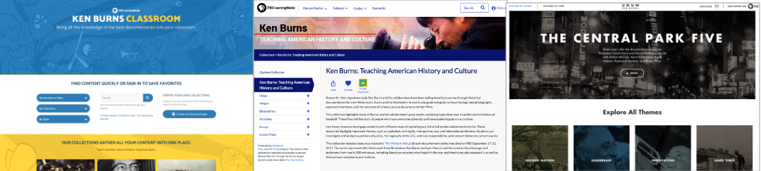
As part of a heuristic analysis, users reviewed screens from three Ken Burns-related websites in unmoderated testing sessions.
Early design explorations
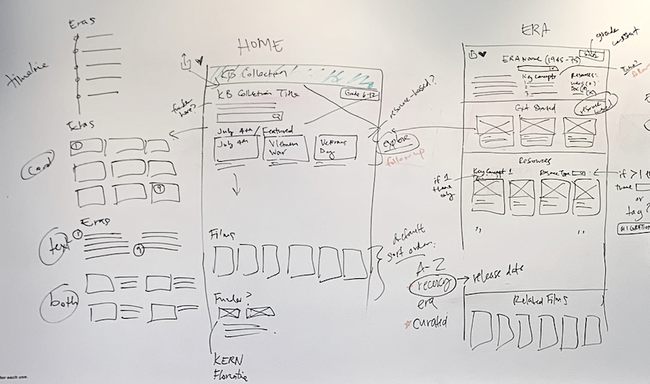
The team met for a round of design jams to sketch out ideas for user flows and content organization.
Wireframes
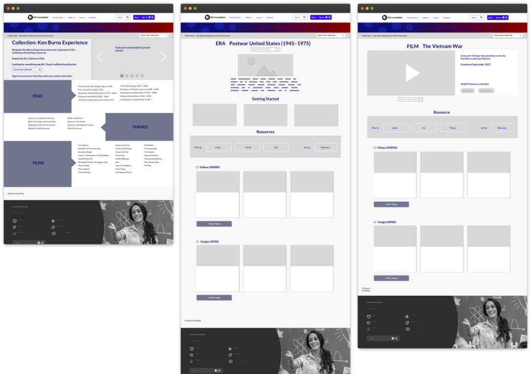
The first round of wireframes for internal review, based on business goals, emphasized themes.
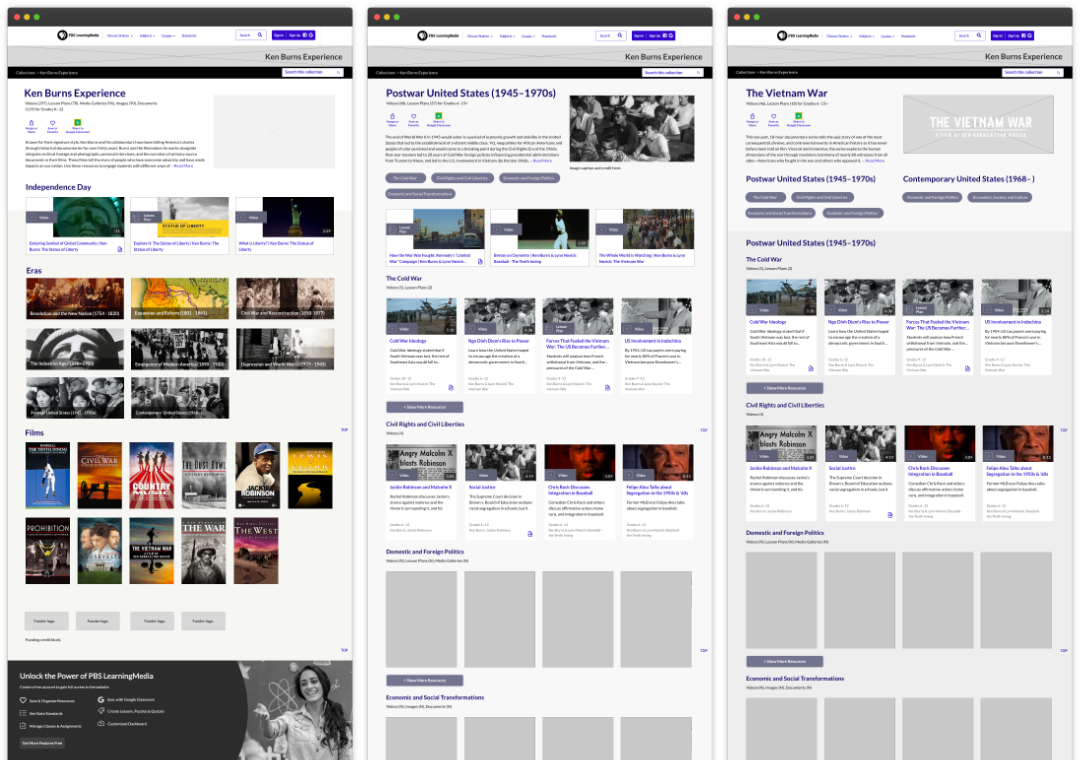
Initial user testing and user research led to moving away from organizing the landing page by themes, to organizing by historical era and film, shown above in the final round of clickable prototypes before visual design.
Visual design
The collection landing page from the live site (design by Iko Gabay).
Results:
- Bounce rate dropped by 10% after relaunch.
- Teachers reported finding the redesigned collection easier to use and to hone in on resources closely aligned to their teaching units over the course of the semester.
- The new approach, organized around eras and themes, instead of by resource type, formed the basis for a new kind of collection structure available to member stations to use.
Lessons Learned
Bringing in external stakeholders early in the design process, through gut checks and surveys, smoothed the path to enthusiastic approvals. Talking to classroom teachers, in conjunction with early usability testing, helped steer us away from a content strategy—focusing on themes—that didn’t align with how teachers look for useful teaching resources.