With a significant multi-year grant, the Center for History and New Media launched the National History Education Clearinghouse, a website for K–12 history teachers to find professional resources, share engaging activities with peers, and learn about best practices. Like many such sites, over time the original structure and design proved inflexible and not easily updated to add new kinds of content—and the interface looked out of date.
Goals
Redesign the existing site to:
- make it easier for visitors to find content most relevant to them,
- increase the visual appeal of the interface,
- enable the developer to add page layout templates for new kinds of content,
- help editors to add content in the CMS, and
- incorporate videos, quizzes, and other interactive components.
Challenge
The first version of the site was created by scholars, built in a way that made it very difficult to modify. The original site architecture created confusion for staff to know where to put—and visitors to find—content. The challenge was to find a way to identify and share the promising practices and resources being developed across the country to improve the teaching of American history, with a site that included more than 9,500 pieces of content in a complex relational database of text, video, and images.
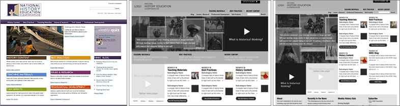
The original home page put the most visual emphasis on category labels. To help faculty better envision the new design, wireframes included real content and images from the existing site, along with placeholders for new kinds of content: a slider of images and captions, and a prominent link to a planned video on historical thinking.
Constraints
The requirements of the grant prevented renaming sections of the site. To help visitors and staff, I implemented a “drawer” in the header that opened with a list-based site map. The home page had to address many competing priorities for screen real estate at a time when the focus was being “above the fold”. I convinced stakeholders that using typographic hierarchy, color, and white space effectively would provide visual cues for scrolling and a more usable interface.
Process
The site redesign took place over about six months, starting with a content audit carried out by a member of the Center’s faculty. My initial work focused on a combination of visual design and information architecture, guided by the core challenge of using design to help visitors find relevant content. Effort proceeded in two parallel streams: exploring color palettes and type, and organizing content in medium fidelity wireframes.
To help teachers who needed to find lessons in a hurry, links for elementary, middle, and high school teachers were added next to the image slider.
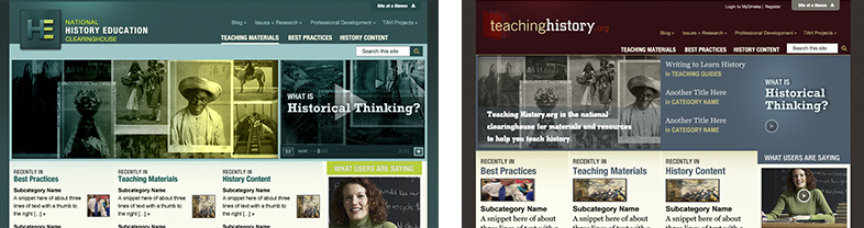
Various color palettes were explored, including one with a vintage feel and one with a cool “tech” feel to it. In the end, the site was renamed Teaching History, and the new logo was based on a metaphor of peeling back layers of history.
Results
Once the design style and home page layout were approved, I then worked with the Drupal developer and a division director to design and mark up templates for a diversity of internal pages, including section splash pages, a template for roundtable discussions, a template for reviews of websites, and a format for quizzes. I wrote the html and css, and the developer pulled the html into Drupal to add database calls. Working remotely through an East Coast blizzard, we launched the new site on time.
“The site really is what I call ‘nonnegotiable’—a tool so valuable that no history teacher should try teaching without it.”—History Tech blog
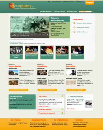
The home page with the final design, using such techniques as sliders and accordions to show teasers of lots of content, and color and type to guide the eye through an extensive range of content.
By 2014, the site was reaching over 2 million unique visitors a year; in an independent evaluation, 98% of users surveyed located the information they were seeking. The site was cited in an issue of American Teacher as one of the best web tools recommended by teachers for teachers.
Following the redesign, 98% of surveyed users located the information they were seeking.
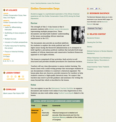
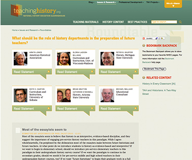
A fun challenge was coming up with ways to make a large amount of text interesting: Using css rather than images to communicate how structured a lesson was, designing visually engaging tables (above), and brainstorming an interactive display of what each speaker had to say at a roundtable discussion (below).
Following the relaunch, I developed the concept for an online ad campaign, revolving around the idea of a toolkit for teachers. One animated ad built in Fireworks garnered the highest-ever click-through rate on the website Edutopia.
Lessons Learned
Remaking this site was my first experience having to balance multiple agendas, collaborate with a developer, and design templates in html and css on tight deadlines. The constraints stimulated creative solutions using html, css, and jquery toolkits to maximum effect.