PBS KIDS for Parents provides articles about child development milestones, and activities connected to PBS KIDS shows, for parents and adult caregivers of kids ages 2 to 8.
Problem
Many PBS stations serve Hispanic and Latino* audiences, but the Parents site was only available in English. Committed to reaching a more diverse audience, PBS initiated a year-long initiative to develop a Spanish language version.
* Recent surveys indicate that most Hispanic and Latino Americans prefer not to use LatinX.
Discovery
Never having designed an alternate language site, I started by soliciting examples of best practices. At the same time, I sought out data on the Hispanic audience as it might affect design from sources including the Pew Research Center, Joan Ganz Cooney Center, and marketing data from MGD Advertising.
I gathered data on Internet usage patterns by age, media type, and device, as well as Internet access by ethnicity, socioeconomic status, and language(s) used in the home.
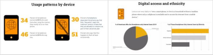
Two charts summarizing some of the user and audience research.
Key take-aways from this research:
- Younger and lower-income Americans heavily rely on their smartphones for Internet access.
- There is considerable overlap between the Hispanic and Latino American and low-income populations
- Low income is associated with limited access to high-speed Internet and limited data plans. Spanish-only families have the least access to broadband.
- Mobile phones are at the heart of digital life for Hispanic and Latino Americans.
This research made it imperative that we optimized site design for mobile devices with limited data plans.
Design and IA
The Spanish site posed two main challenges. The first one was developing an information architecture that would work for bilingual parents who might want to switch between English and Spanish content.
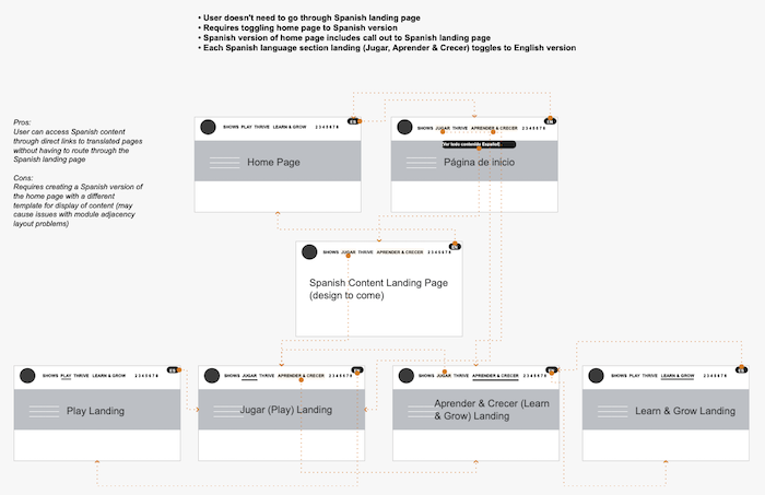
After weighing the pros and cons, the product team chose this site flow map, the second of two.
The second challenge was finding the best way to make a language toggle visible but not obtrusive. A few rounds of design and stakeholder feedback resulted in a toggle button above the main content on each page available in Spanish, as well as a language switch in the header.
Prototyping and Testing
Initially, the plan was to offer both English and Spanish versions of content on each page, starting with the landing page of the Learn & Grow section. I designed two versions of the page, one that put the Spanish and English on the same page, accessible via a toggle; and one that showed the Spanish version by default, with the English content tucked into an accordion.
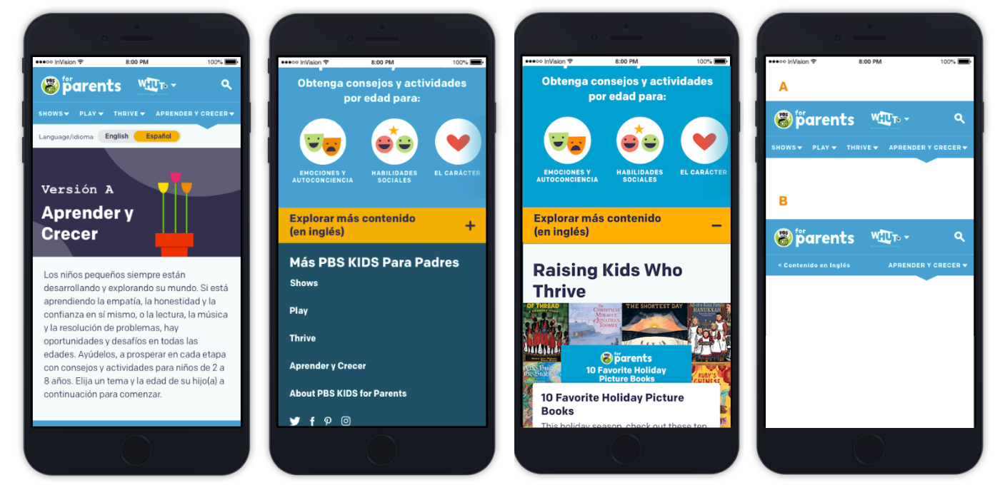
In tests, users offered feedback on either mixing English and Spanish content together, or separating them. They also voted on two versions of site navigation, one showing English and Spanish; the other only showing a navigation link for content in Spanish.
Five of six parents in an unmoderated test on phones preferred the accordion solution, if that was the only option. However, the testers indicated that, even if there was less content than in the English-version site, they would prefer a Spanish-only version.
As a result, we designed a Spanish-specific home page that would only link to the content that had been translated.
Launch and Impact
The insights gleaned in designing and developing the Spanish Parents site reverberated to the English version: going forward, we now start with mobile designs for new features and sections. With the data about reliance on data plans to access the web, developer Krista Fuentes undertook significant work to improve overall page performance. As a result, both versions of the site now perform more efficiently on mobile than competitor sites.
The product team continues to translate content to make the Spanish version more robust.