PBS LearningMedia (PBSLM) is a site designed for K–12 classroom teachers, who can build lessons from more than 20,000 video clips from PBS’s extensive library. The student site provides a launching pad for getting and completing assignments, and hopefully encourage independent exploration.
Problem
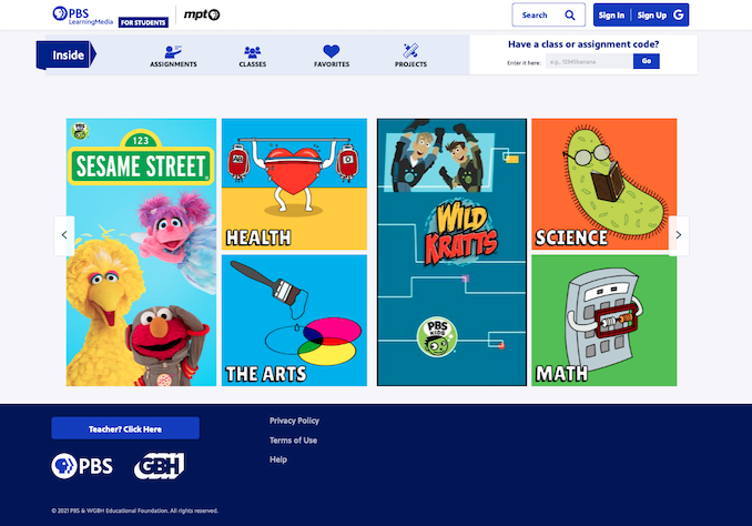
The original home page made the site seem as if it was designed for elementary school kids.
The original design skewed much younger than the high school audience PBSLM was trying to reach. In addition, the product team envisioned enhancing the student site to focus on fostering media literacy and providing a way for students to get content more relevant to their interests so that they might explore media outside of assignments.
Challenges
Time—the UX research and UI design needed to be completed in time for the 2021 school year, giving us six months for discovery, wireframing and prototyping, user testing, visual design, development, and QA testing.
Technical infrastructure—the home page was built on an old, outdated codebase. Introducing dynamic content meant rebuilding it from the ground up to connect to the database.
Human resources—once the decision was solidified to display featured and recommended content, the engineers needed to devise a way to avoid adding more curation duties to already time-strapped editors.
Setting up
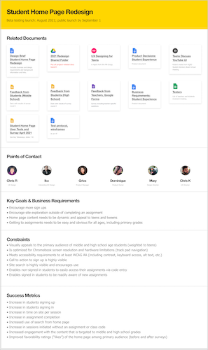
Using a Figma template, I created a project overview that included links to documents, team members and roles, business requirements, and success metrics; this provided a central place for the product team. I also created a timeline to coordinate UX, UI design, user research, and development.
I now start every large project by creating a Project Overview page in Figma.
Discovery
I informed myself on existing research on visual design for different ages—what tweens and teens responded to, liked, and disliked. The product manager connected me to middle- and high-school students, via PBSLM’s “digital innovators” teachers, for discovery efforts: a 30-second gut-check survey on competitor student learning sites.
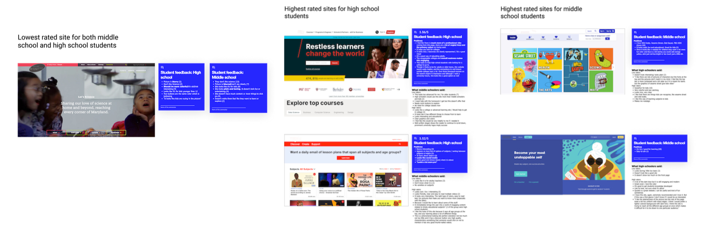
I summarized the feedback from the 30-second gut check survey.
Wireframing and prototyping
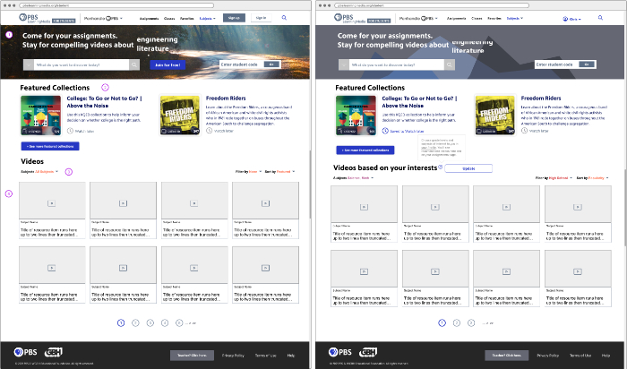
This concept gave the most visual emphasis to videos. When the student signs in, “Videos” changes to “Videos based on your interests”, gleaned from the student taking an interest quiz. A pop-up alerts students to update their interests to see different content.
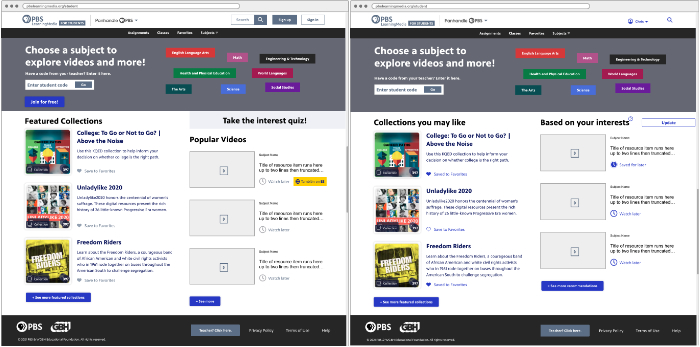
In this concept, more emphasis is given to collections of media resources, giving those equal billing with videos.
I developed three different concepts for a new home page, all including an interactive “quiz” that would provide a way for a student to tell us their interests without having to provide personally identifiable information. After presenting them to stakeholders for feedback, one concept was selected for early user testing with students.
Students were asked for their general impressions, what they liked and disliked, their thoughts on the "quiz," and how likely they would be to visit the site for their own exploration.
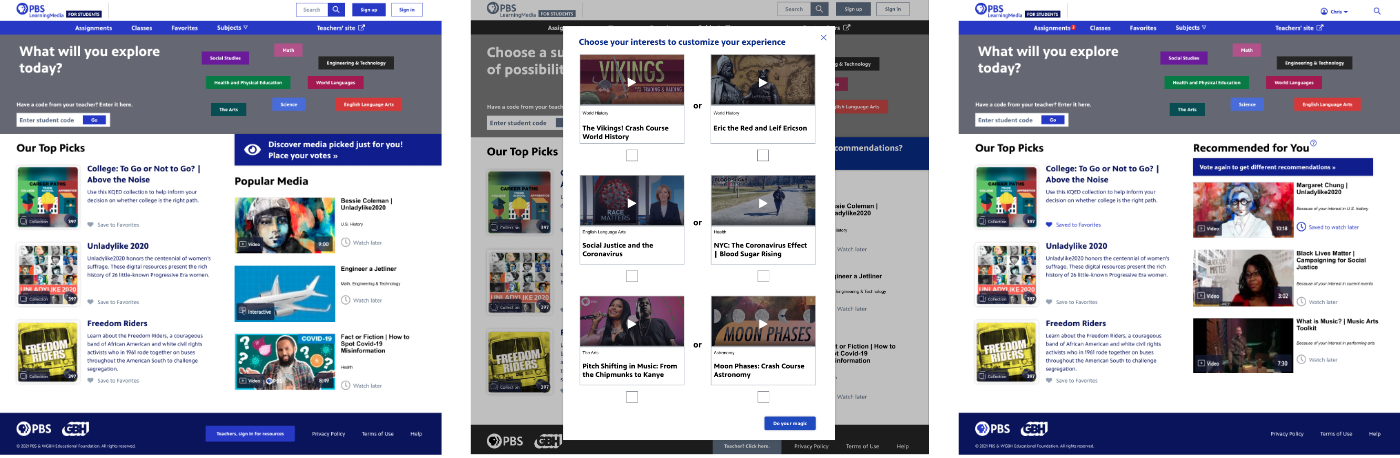
Students participated in a round of user testing of this prototype, including the interests quiz (middle).
Building to launch
The feedback fed into the design I handed off to Iko Gabay, a visual and interaction designer, who refined the designs and developed an animated "tag cloud" to engage students' interests. The layout was revised to make it more flexible and easier to display fresh content, and the engineering team built a tune-able recommendation engine to simplify curation (and ensure no duplication of a top pick and a popular resource).
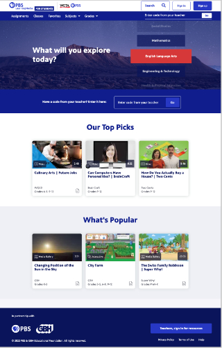
The new home page includes a scrolling “tag cloud” of subjects for students to explore, three top picks generated via the recommendation engine, and three popular resources.
The new “student experience” launched on time; however, the interests quiz has yet to be implemented due to budget and resource constraints.