The American Battle Field Monuments Commission (ABMC) launched a professional development program for middle- and high-school teachers. Eighteen teachers were selected in the first year of a multi-year program to create interdisciplinary lessons to share with other educators.
Goal
To bring ABMC resources into classrooms so that students can better understand the experiences and sacrifices of service members in World War II.
Challenge
While the site’s central audience is classroom teachers and their students, ABMC also wanted military and history buffs, as well as descendants of the fallen, to be able to discover content. The site also needed to account for detailed, lengthy lesson plans and biographical essays, both for readability on tablets and to help other teachers quickly find lessons and activities for their own students.
Process
The first step was to outline user personas and onsite behaviors and flows for different target audiences. Navigation paths and page description diagrams generated discussion divorced from visual design. ABMC staff described this approach, new to them, as very helpful in thinking through overall information architecture and users’ needs. It allowed for fast rounds of refinement and revision before committing to building page templates.
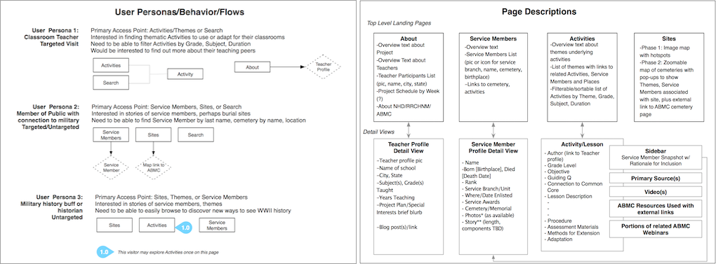
Developing personas, page descriptions, and user flows in advance of visual design facilitated a focus on user needs and content structure.
In parallel, I sketched out ideas for a logo, and drafted a tagline for the home page that would succinctly capture the purpose of the site and speak to each target audience: Meaningful battle memorials. Powerful stories. Engaging classroom activities.
Following approval of the information architecture, I prototyped a responsive design in Webflow. For the initial launch, the hero area was a static image. After the first summer, a background video created by RRCHNM’s videographer, Chris Preperato, was swapped in to set the mood for a site full of moving stories of sacrifice told by teachers to teachers.
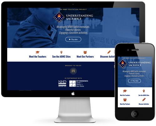
A tagline that spoke to different audiences, and a video of teachers examining the headstones of their fallen heroes sparked emotional engagement.
Content Modeling
Teachers these days have the whole Internet available to them to find lessons. But how do they assess their value? To better understand how best to present long, detailed lessons effectively online in the days of mobile device usage, I interviewed a high school history teacher, and also looked at how other sites organized lessons. This research shaped a content strategy for lessons and a content model for the teachers to use in writing their lessons: each one had to include a guiding question, an overview, and a quote from the teacher about his/her motivation for choosing their fallen hero. In conjunction with a sidebar listing Grade Level and Subject, this enabled teachers to evaluate the lesson at a glance and download a nicely formatted pdf with appropriate page breaks, instead of printing a web page. Progressive disclosure of the activity sections enabled those who wished to do so to read the entire lesson plan in the browser.
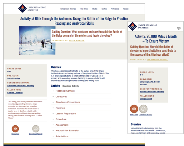
User research identified the information most important to a teacher evaluating lessons for her students: Grade level, subject, and overview. That information appears first in the mobile layout, while less important information appears further down or doesn’t display at all.
Reaching Other Audiences
For relatives and descendants of the fallen, each battlefield monument site’s landing page lists a link to each service member’s story. Visitors interested in military history or battle memorials can use an interactive, responsive map of the sites to find related content.
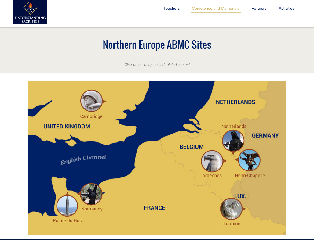
Traditional image maps aren’t responsive. A search for a better method resulted in a map that combined bitmaps, svg, and responsive css to provide a good user experience on desktop and mobile devices.
Results
The site won first place in the Digital Media category for the National Association for Interpretation 2016 Interpretative Media Awards.