The supply of certified ESL teachers can’t keep up with demand. There are few quality tools available that enable teachers of English learners to create lessons using their school system’s academic vocabulary and curriculum, and even fewer that enable them to build engaging, interactive activities and games.
Goal
Design an app that enables teachers of English language learners to:
- create custom wordlists of words with audio, video, and images
- easily build interactive lessons from wordlists
- assign lessons to their students and classes, and monitor progress.
“Now this is a product I can sell.”—VP of Sales, after seeing the revised user interface
Challenge
Teachers who signed up for and were using the early pre-launch versions of Speak Agent were excited about its promise, but the user interface was confusing, and it could be hard for a teacher to understand the workflow. The information architecture also needed to plan for scaling up to be used with multiple classes, and across an entire school or school system.
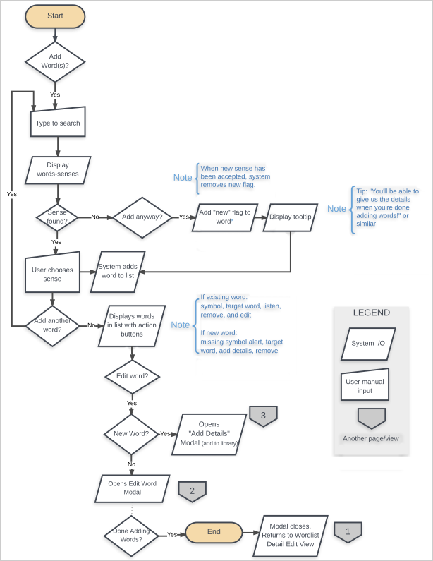
To meet its business goals, Speak Agent Inc. also needed an improved workflow for users to submit words to its library, and the interface needed to encourage users to do so.

One of the first steps in the process was diagramming the existing screens’ components and user actions to identify gaps and problem areas.

Analysis of the existing user interface identified areas for improvement in terms of information and typographic hierarchy.
Constraints
The app was already in use by some early adopters, so completely changing the information architecture was not a realistic option. Formal usability testing wasn’t feasible, but some quick guerrilla testing coupled with review of informal feedback helped inform decisions on remaking the user interface and interactions.
Process
When the decision was made to overhaul the interface, I delineated a few key principles to direct my work:
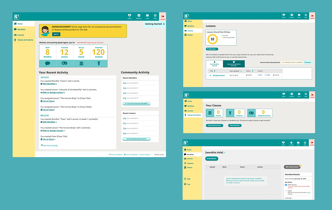
- Take into account two overarching user journeys: the new user and the ongoing user. For the new user, I looked for ways to help her know what to do each step of the way, and how to get started. Each section’s dashboard was designed with an “empty” state for the user who has yet to use that part of the app. For the ongoing user, a busy teacher with little free time, I rethought the layout of each view to enable her to pick up where she left off on last login, whether it was starting a wordlist, assigning a lesson, or setting up a class.
- Clarify the purpose of each view and reduce decisionmaking: I aimed to simplify the interface to emphasize the actions relevant to each view, and minimize clusters of large buttons. See a good discussion of this topic here.
- Use modals and asides appropriately: The first version of the app used asides for two different purposes, which was confusing and created potential usability issues on tablets. In the revamp, the interface uses modals when the app required a teacher to interrupt her flow to take multiple steps, such as creating a lesson from games. Asides are reserved to provide teachers a quick view of the details of a wordlist or lesson, for example.
- Find ways to increase emotional engagement: Instead of using icons alone to convey information, I drafted microcopy that used the voice of a helpful friend to explain actions, and spoke in terms that connect with teachers. For example, on the home dashboard, the teacher is shown statistics on how many lessons and wordlists they’ve created, and how many students they’ve reached.
- Improve data display: the order of columns in tables was reconsidered, and the leftmost column was sorted by recency to enable the teacher to see the most recent activity. Tabs were added to enable the teacher to view their content alone, or the community’s content alone.
- Encourage community: Most teachers enjoy sharing their knowledge with peers. We took that into account by adding a Community Activity Feed to the home Dashboard, showing stats on community contributions, and planning for teachers to be able to “like” others’ contributions. Microcopy was added to the process for adding new words to acknowledge the submitter’s contribution to the community.

The reworking of the UI and UX sought to account for the journeys of new and ongoing users, as well as clarify the purpose of each view through the use of typographic hierarchy, white space, and judicious use of buttons.

Results
As the new interface and UX were shared internally and with some early beta users, the head of School Partnerships expressed excitement at being able to sell the product to school districts. Speak Agent launched in the first quarter of 2017. In the first month, sign-ups surged, and interest among language-learning influencers on social media peaked.
Lessons Learned
I joined the company after the initial product launch, and as they were scaling up in size. Since the product’s launch, I’ve worked with the product owner, project manager, marketing and tech teams to formalize a process that includes documenting business requirements, thinking through use cases, and use of realistic sample data.
